
- View products

Windows OS (2nd Gen)
NearHub Board Max

Windows OS
NearHub Board S Pro

For Huddle Rooms
NearHub Board S55

For Medium Rooms
NearHub Board S65

For Large Rooms
NearHub Board S75

For Broad Rooms
NearHub Board S86

Smart Digital Photo Frame with Air Quality Monitor
NearHub Frames 10

USB Drawing Tablet
NearHub MagicPad ST1160

Real-time Online Whiteboard
NearHub Canvas

Digital Signage and Batch Management
NearRooms
- View products

True 4K 360° All-in-1 Camera for Hybrid Meetings
Nearity 360 Alien

True 4K 120° All-in-1 Camera for Team Collaboration
Nearity 120 Max

Professional Audio&Pioneering Daisy-Chain
Nearity A20S

4K UHD 120° Webcam for Hybrid Meeting
Nearity V30S

360° All-in-one Camera for Pro Group Chat
Nearity 360 Basic

All-in-one Camera for Group Meeting
Nearity C45

Powerful PTZ Camera with 10x Hybrid Zoom
Nearity V410

Firmware Updater and Device Controller
NearSync
- View products
- Meeting Room
- Meeting Scenario
- Whiteboard


Are you overwhelmed trying to find the perfect aesthetic picture frames for your home or office? Perhaps you’ve noticed that even the most beautiful artwork can lose its charm if not paired with the right frame. Or maybe you’re unsure how to match your frames with your existing decor, colors, or textures. You’re not alone! Many people struggle with choosing frames that elevate their artwork and create a cohesive space.
This guide will walk you through everything you need to know about how to select the perfect aesthetic photo frame, ensuring your art stands out while harmonizing with your environment. Whether you’re a seasoned interior designer or just looking to freshen up your space, understanding how to match art, color, and texture is key to creating a beautiful, inviting atmosphere.
Understanding Your Artwork: The First Step to Choosing Aesthetic Picture Frames
Before you even glance at a frame, take a good, long look at your artwork. What is it? A vibrant abstract painting? A serene landscape photograph? A whimsical illustration? The nature of your art is the most important factor in determining the right frame.
The Style of Your Art Matters
Different art styles call for different framing approaches. A minimalist line drawing might be overwhelmed by an ornate, heavy frame, while a grand oil painting could look lost in a thin, simple one.
Photography: Black and white photos often look stunning in sleek, modern black or metallic frames. Color photographs can be versatile, but consider the dominant colors in the image. A crisp white mat with a simple wood or metal frame can highlight the details. For a more contemporary feel, consider frameless or acrylic options.
Paintings: The era and style of the painting are key. Traditional oil paintings often benefit from ornate, gilded, or dark wood frames that evoke a sense of history and richness. Modern abstract pieces might pair well with clean-lined metal frames, deep shadow boxes, or even brightly colored frames for a bold statement. Watercolors and pastels, being more delicate, often look best in lighter wood, muted colors, or simple white frames.
Illustrations and Prints: These can be incredibly varied. Whimsical illustrations might suit colorful, playful frames, while graphic prints could look sharp in geometric or metallic designs. For prints with a lot of text or intricate detail, a simple mat and a clean frame can prevent visual clutter.
Posters: Depending on the poster’s design, you might opt for a basic black or silver frame for a casual look, or a more substantial wood frame if it’s a piece you want to feature more prominently.
Matting: A Crucial Complement to Your Aesthetic Picture Frame
A mat board is the material that sits between your artwork and the frame. It’s not just decorative; it serves functional purposes too. A well-chosen mat can:
Add visual breathing room: This is especially important for busy artworks or photographs.
Enhance the artwork: A mat can draw the eye into the image, making it the focal point.
Protect the artwork: A mat prevents the artwork from touching the glass, which can prevent moisture damage and sticking.
Choosing the right mat color:
White or Off-White: Classic and versatile, these mats work with almost any artwork and frame style. They provide a clean, bright look that makes colors pop.
Cream or Beige: Offer a softer, warmer feel than pure white, ideal for vintage pieces, sepia-toned photos, or artworks with warm color palettes.
Black: A bold choice that can add drama and sophistication, particularly effective for black and white photography, graphic art, or modern pieces.
Colored Mats: These can be used to pick up a secondary color in the artwork or to create a specific mood. Use them sparingly and thoughtfully to avoid overpowering the art.
The width of the mat also influences the overall aesthetic. A wider mat can make a smaller piece feel more substantial and gallery-worthy, while a narrower mat can suit more casual displays. When pairing a mat with your aesthetic picture frame, consider how the mat color and width will interact with both the artwork and the frame material.
How to Choose Aesthetic Picture Frames: Matching Color Palettes
Color is a powerful tool in interior design, and it plays a significant role in selecting the right frame. The frame’s color can either blend seamlessly with your existing decor or create a striking contrast.

Harmonizing with Your Room’s Color Scheme
The easiest way to ensure a frame looks good is to have it complement the dominant colors in the room where it will be displayed.
Neutral Frames (White, Black, Gray, Wood Tones): These are your safest and most versatile bets. They tend to blend in without demanding too much attention, allowing the artwork to be the star.
White: Brightens spaces, works well with light and airy decor, and makes colors in the artwork pop.
Black: Adds a modern, sophisticated, or dramatic touch. Excellent for contrast and grounding a piece.
Gray: Offers a softer alternative to black, providing a modern and elegant feel.
Wood Tones: From light birch to dark walnut, wood frames add warmth and natural texture. Light woods fit Scandinavian or bohemian styles, while dark woods suit traditional or more formal settings.
Metallic Frames (Gold, Silver, Brass, Copper): These can add a touch of glamour, modernity, or vintage charm depending on the finish and style.
Gold/Brass: Adds warmth, luxury, and a classic feel. Works well with traditional, art deco, or glamorous styles.
Silver/Chrome: Offers a cool, contemporary, and sleek look. Ideal for modern, minimalist, or industrial interiors.
Copper: Provides a warm, industrial, or bohemian vibe.
Colored Frames: This is where you can get bolder.
Pick a Dominant Color: Choose a frame color that matches a primary color in your room’s decor.
Pick an Accent Color: Select a frame that matches a secondary or accent color in your room. This can create a subtle connection.
Contrast is Key: Sometimes, a frame in a color that contrasts with your room’s palette can be incredibly impactful, drawing attention to the artwork. For example, a bright teal frame in a mostly neutral room.
Coordinating Frame Color with Artwork Color
Beyond the room’s colors, consider the colors within the artwork itself.
Match Key Colors: If your artwork features a prominent color, a frame in that same color (or a similar shade) can create a unified look. This is especially effective with abstract art or graphic prints.
Complementary Colors: Use colors that are opposite each other on the color wheel to create a vibrant contrast. For example, a blue artwork might look stunning in an orange frame.
Analogous Colors: Colors that are next to each other on the color wheel create a harmonious and pleasing effect. A piece with greens and blues might be beautifully framed in a frame that leans towards teal or emerald.
Monochromatic Scheme: Using different shades of the same color for the frame, mat, and artwork can create a very sophisticated and cohesive look.
Simple Color Matching Guide:
Artwork Color | Frame Color Suggestions (Room Harmonizing) | Frame Color Suggestions (Artwork Harmonizing) | Style Impact |
|---|---|---|---|
Blue | Neutral (gray, silver, light wood) | Navy, Teal, White | Calm, Modern, Sophisticated |
Red | Neutral (black, charcoal, dark wood) | Burgundy, Blush Pink, Gold | Bold, Dramatic, Warm |
Green | Neutral (brown, cream, brass) | Emerald, Forest Green, White | Natural, Elegant, Fresh |
Yellow | Neutral (white, light wood, gold) | Mustard, Ochre, Light Gray | Cheerful, Sunny, Vintage |
Black & White | Black, White, Silver, Gray | Black, White, Bold Contrasting Color (e.g., Red) | Modern, Classic, Dramatic |
Ultimately, the goal is to create a visual dialogue between the artwork, the frame, and the space. Don’t be afraid to experiment with different color combinations, but always keep the overall balance and your personal aesthetic in mind.
How to Choose Aesthetic Picture Frames: Leveraging Texture
Texture adds depth, interest, and a tactile quality to your decor. The material and finish of your picture frame can significantly influence the overall feel of your display.
Exploring Different Frame Materials
The material of your frame will dictate its inherent texture and style.
Wood: The most traditional and versatile material.
Smooth Wood: Offers a clean, refined look. Can be stained in various colors or painted. Suitable for modern, minimalist, or traditional styles.
Distressed or Reclaimed Wood: Adds rustic, bohemian, or farmhouse charm. Perfect for bringing natural elements indoors.
Carved or Ornate Wood: Ideal for traditional, vintage, or opulent interiors, often featuring intricate patterns and finishes.
Metal: Offers a sleek, modern, or industrial feel.
Brushed or Matte Metal (Silver, Black, Bronze): Provides a contemporary and sophisticated look without being overly reflective. Great for modern art and minimalist decor.
Polished Metal (Chrome, High-Gloss Silver): Adds a high-shine, glamorous, and futuristic element.
Gold or Brass (Polished or Brushed): Can range from vintage elegance to modern luxury, depending on the finish.
Acrylic/Lucite: Creates a modern, airy, and almost invisible frame.
Clear Acrylic: Offers a minimalist, floating effect, allowing the artwork to take center stage. Excellent for contemporary spaces.
Colored or Frosted Acrylic: Can add a subtle pop of color or a softer diffusion of light.
MDF/Composite Materials: Often used to mimic wood or other finishes at a more affordable price point. Quality can vary, but many offer good durability and a wide range of styles and finishes.
Fabric Wrapped Frames: Such as linen or velvet, add a unique, soft, and luxurious texture. These are excellent for personalizing displays and adding a touch of plushness.
Texture and Mood: Creating the Right Atmosphere
The texture of your frame can heavily influence the mood of your display and the room.
Smooth, polished textures (high-gloss metal, smooth lacquered wood) often convey modernity, sophistication, and a clean aesthetic. They are excellent for minimalist or contemporary designs.
Rough, natural textures (distressed wood, raw linen, unfinished metal) bring a sense of warmth, earthiness, and authenticity. These fit well with rustic, bohemian, or farmhouse decor styles.
Ornate, textured surfaces (carved wood, embossed metal) suggest tradition, luxury, and a classic elegance. They are suitable for more formal or vintage-inspired interiors.
When selecting aesthetic picture frames, consider how the frame’s texture will interact with the textures already present in your room. Do you want to add a contrast, like a sleek metal frame against a textured wallpaper? Or do you want to reinforce a theme, like a rough wood frame complementing a cozy, knit throw?
Mixing and Matching Textures
Don’t be afraid to mix textures within a gallery wall or a collection of frames. This can add visual interest and prevent your display from feeling too uniform or predictable. For instance, a mix of smooth wood frames, a brushed metal frame, and a linen-wrapped frame can create a dynamic and engaging display.
Texture Consideration Table:
Frame Material | Typical Texture | Associated Moods | Best For |
|---|---|---|---|
Wood (Smooth) | Sleek, Polished | Modern, Elegant, Clean | Contemporary, Minimalist, Scandinavian |
Wood (Distressed) | Rough, Uneven, Natural | Rustic, Cozy, Bohemian, Vintage | Farmhouse, Craftsman, Eclectic |
Metal (Brushed) | Matte, Subtle Grain | Modern, Industrial, Sophisticated | Mid-Century Modern, Industrial, Contemporary |
Metal (Polished) | High-Gloss, Reflective | Glamorous, Futuristic, Bold | Art Deco, Hollywood Glam, Ultra-Modern |
Acrylic | Smooth, Transparent | Airy, Minimalist, Floating, Unobtrusive | Modern, Minimalist, Contemporary, Abstract Art |
Fabric (Linen) | Woven, Soft, Tactile | Cozy, Chic, Natural, Understated Luxury | Coastal, Bohemian, Scandinavian, Cozy Interiors |
By consciously considering the texture of your frames, you can add another layer of depth and personality to your home decor.
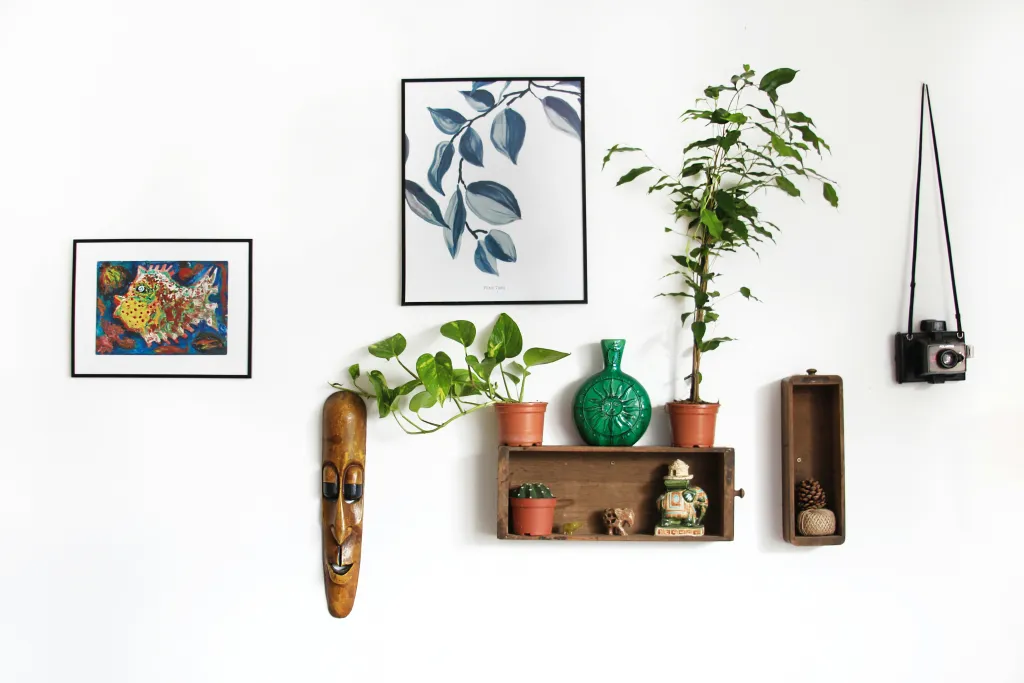
Creating a Cohesive Gallery Wall with Aesthetic Picture Frames
Gallery walls are a fantastic way to display a collection of art and photos, but they require careful planning to look cohesive rather than chaotic. Choosing aesthetic picture frames that work together is key.
The Grid vs. The Eclectic Mix
The Grid: For a super clean and organized look, use identical frames. This creates a strong sense of order and balance. All frames the same size, same color, and same style.
The Eclectic Mix: More common and often more personal, this involves mixing frames. To make it work:
Maintain a Consistent Color Palette: Use frames in similar colors (e.g., all black and white, or all wood tones with variations).
Stick to a Size Range: Avoid mixing tiny frames with giant ones unless done very intentionally.
Repeat a Frame Style: Have one or two frame styles that appear more than once in the arrangement.
Use a Neutral Mat: A consistent mat color (like white or off-white) can tie together mismatched frames.
How to Arrange Your Gallery Wall
Lay it Out: Before hanging, lay out your frames on the floor or a large piece of paper to experiment with arrangements.
Start with a Focal Point: Place your largest or most important piece first, then build around it.
Vary Sizes and Orientations: Mix horizontal and vertical frames, and vary the sizes to create visual interest.
Consider Spacing: Aim for consistent spacing between frames (usually 2-4 inches).
Tips for Choosing the Perfect Aesthetic Photo Frame
Consider Durability: If the artwork will be in a high-traffic area or exposed to sunlight, choose frames with UV-protective glass and sturdy construction.
Think About Hanging Hardware: Ensure the frame comes with appropriate hardware for hanging, or be prepared to add it.
Don’t Forget the Glass: Standard glass can be reflective. Consider non-glare or UV-protective glass for better viewing and preservation.
Embrace Digital: For digital art or collections of photos, a smart digital whiteboard can be an innovative way to display your chosen aesthetic. These can showcase a rotating gallery of images with a sleek, modern presentation.
Editing is Key: Before framing, ensure your photos are at their best. Tools like an instagram photo editor can help you enhance colors, crop, and apply filters to make your images truly shine, making them perfect candidates for your chosen aesthetic picture frame.
Shoot for Success: The quality of your original photo matters. Exploring iphone photography apps can help you capture stunning images right from your phone, setting you up for beautiful framed results.
Frequently Asked Questions About Choosing Aesthetic Picture Frames
Q1: How do I choose a frame for a print with a lot of color?
For vibrant prints, a neutral frame (white, black, or natural wood) often works best to avoid competing with the artwork. A mat can also help break up the color. However, if you want to be bold, you can choose a frame in a muted tone of one of the dominant colors in the print.
Q2: What’s the difference between a frame and a mat?
A frame is the outer border that surrounds the entire piece, providing structure and style. A mat is a cardboard-like material that sits between the artwork and the glass, creating a border around the image itself.
Q3: Can I mix different types of frames on one wall?
Absolutely! Mixing frame styles, materials, and colors can create a dynamic and personalized gallery wall. The key is to maintain some consistency, such as a shared color palette or similar spacing, to ensure the display looks intentional rather than haphazard.
Q4: When should I choose a frame without a mat?
Frameless displays or pieces framed without mats are often chosen for modern art, large-format photography, or to create a minimalist “floating” effect. It’s a stylistic choice that can make a piece feel very contemporary.
Q5: What are the most popular aesthetic picture frame styles right now?
Currently, clean-lined, minimalist frames in black, white, and natural wood tones are very popular. Metallic finishes like brushed brass and matte black are also trending. Distressed wood and unique textured frames are great for adding character and a bohemian or rustic feel.
Conclusion: Your Walls, Your Masterpiece
Choosing aesthetic picture frames is more than just picking out a container for your art; it’s about enhancing your decor, expressing your personality, and creating a space that feels uniquely yours. By thoughtfully considering the style of your artwork, the colors in your room and art, and the textures you want to incorporate, you can transform ordinary walls into captivating displays.
Remember, there’s no single right answer. The best frames are those that speak to you and your space. Don’t be afraid to experiment, trust your instincts, and have fun with the process. Whether you’re framing a cherished family photo, a piece of fine art, or a print you picked up on vacation, the right frame will elevate it and contribute to the overall beauty and harmony of your home. So go forth, explore the possibilities, and let your walls tell your story with beautiful, aesthetic photo frame selections!


